
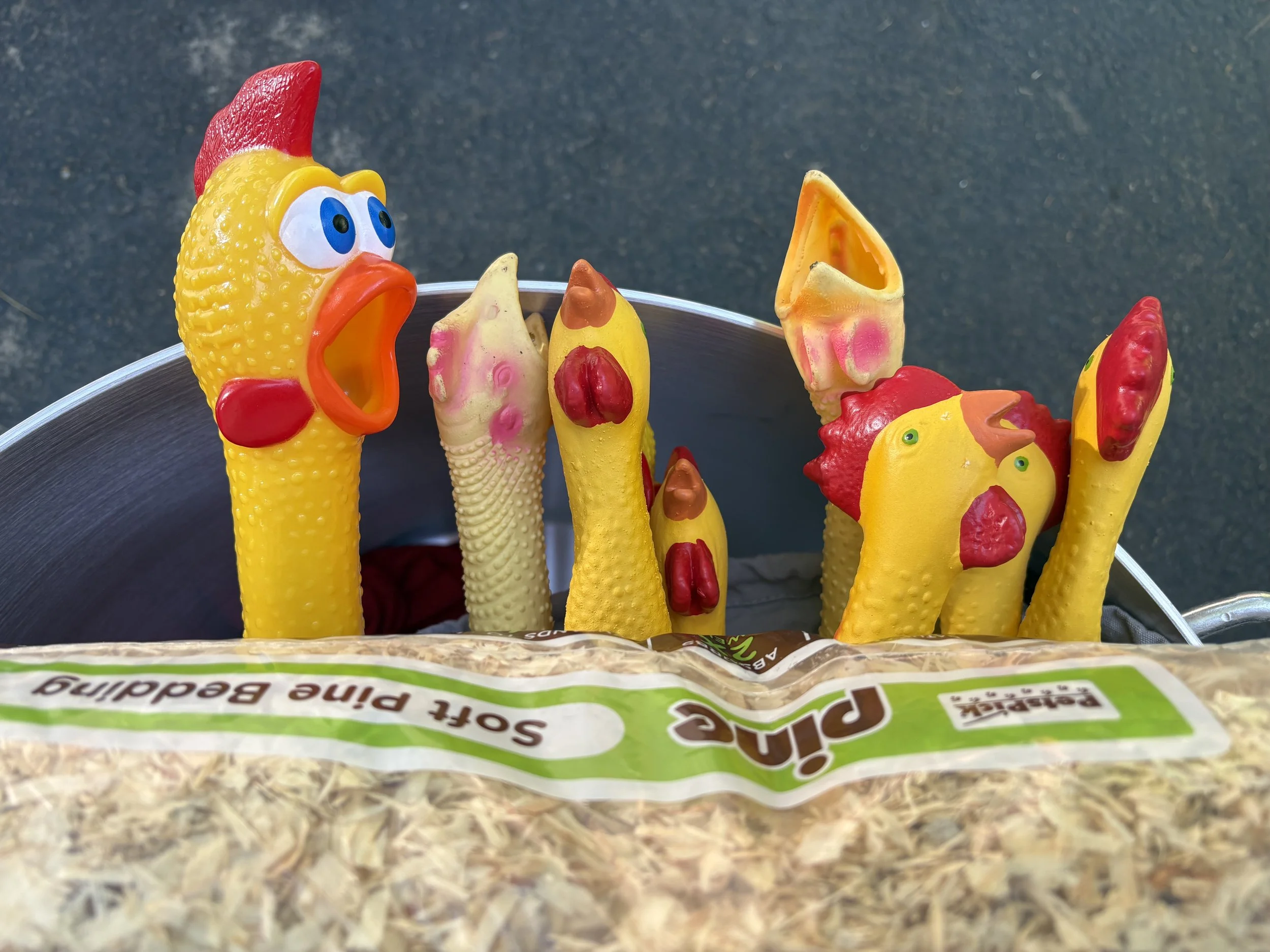
RUBBER CHICKEN TOSS
BRAND IDENTITY | WEBSITE DESIGN + DEVELOPMENT | PRINT COLLATERAL
what we did
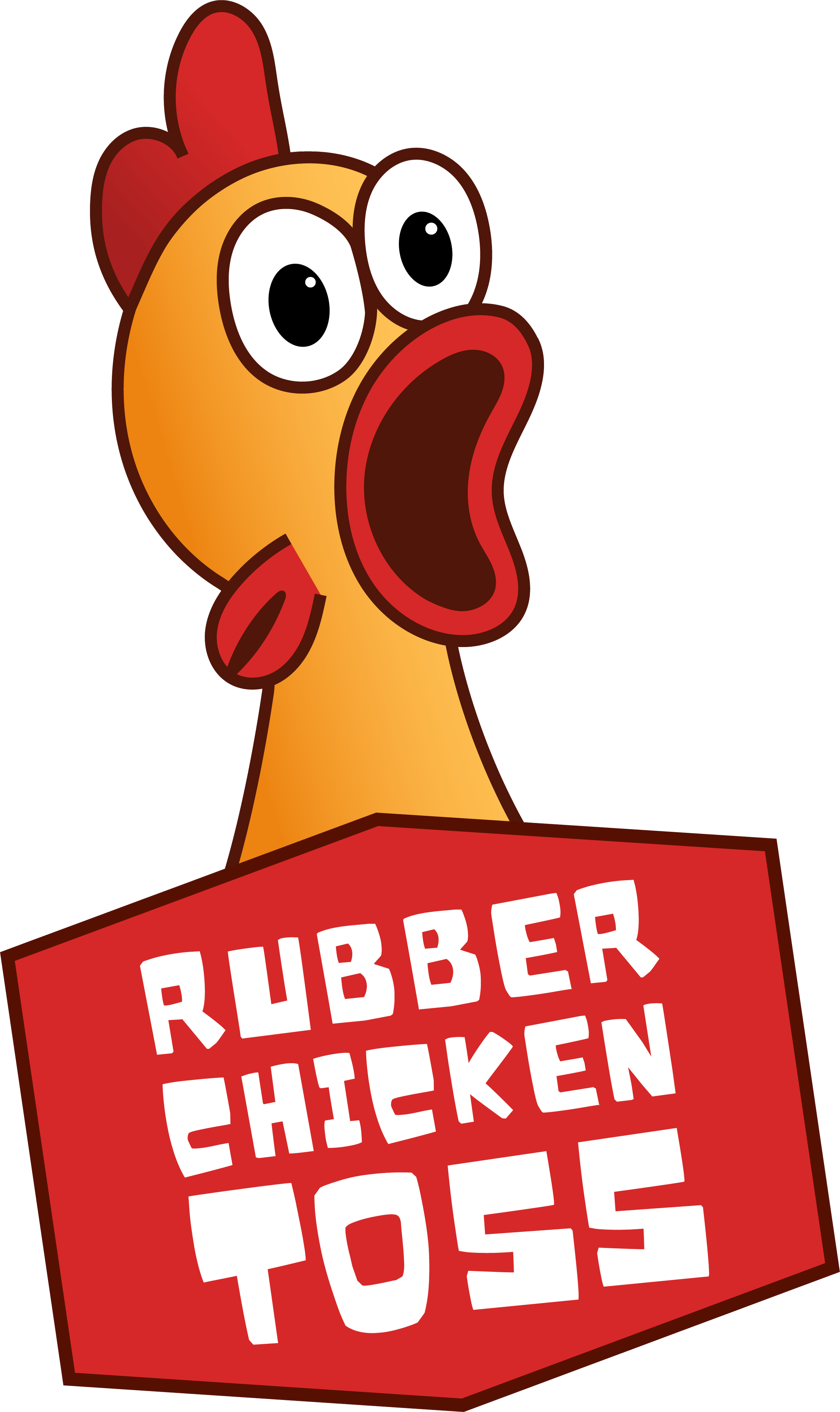
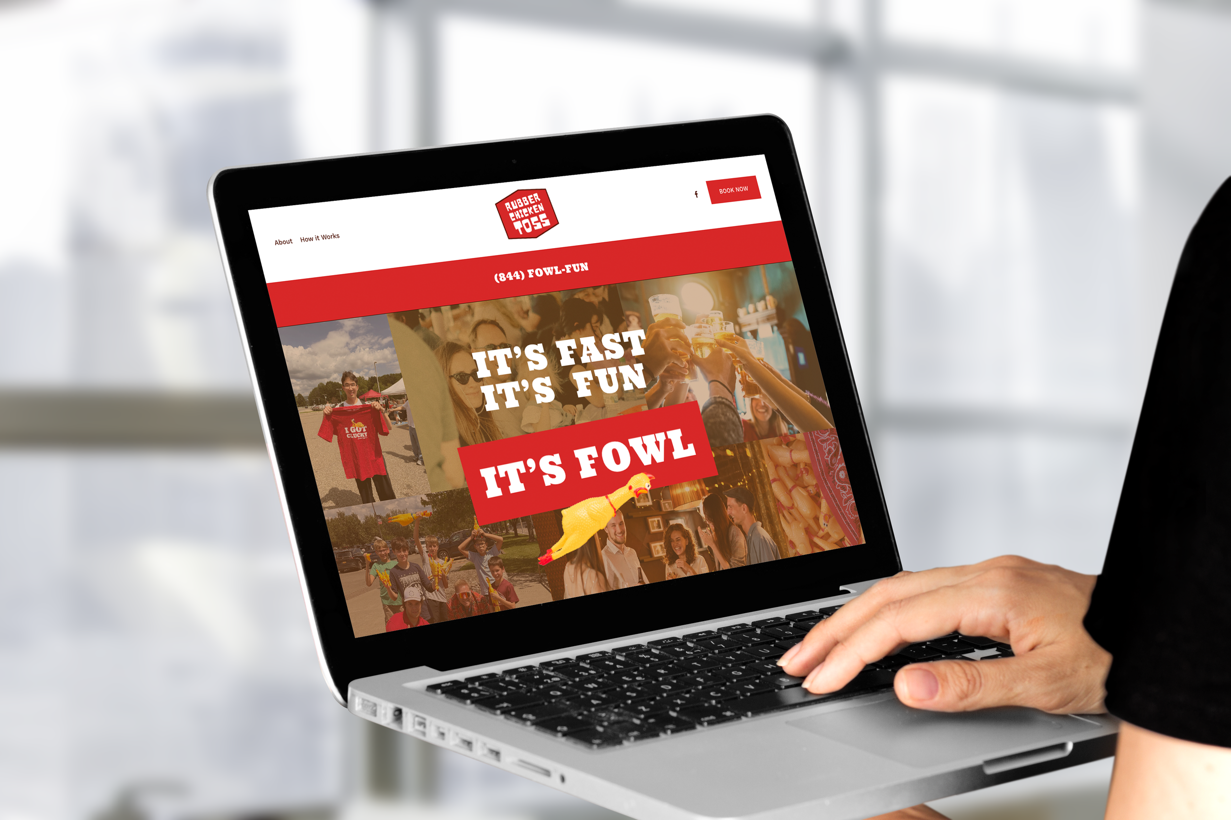
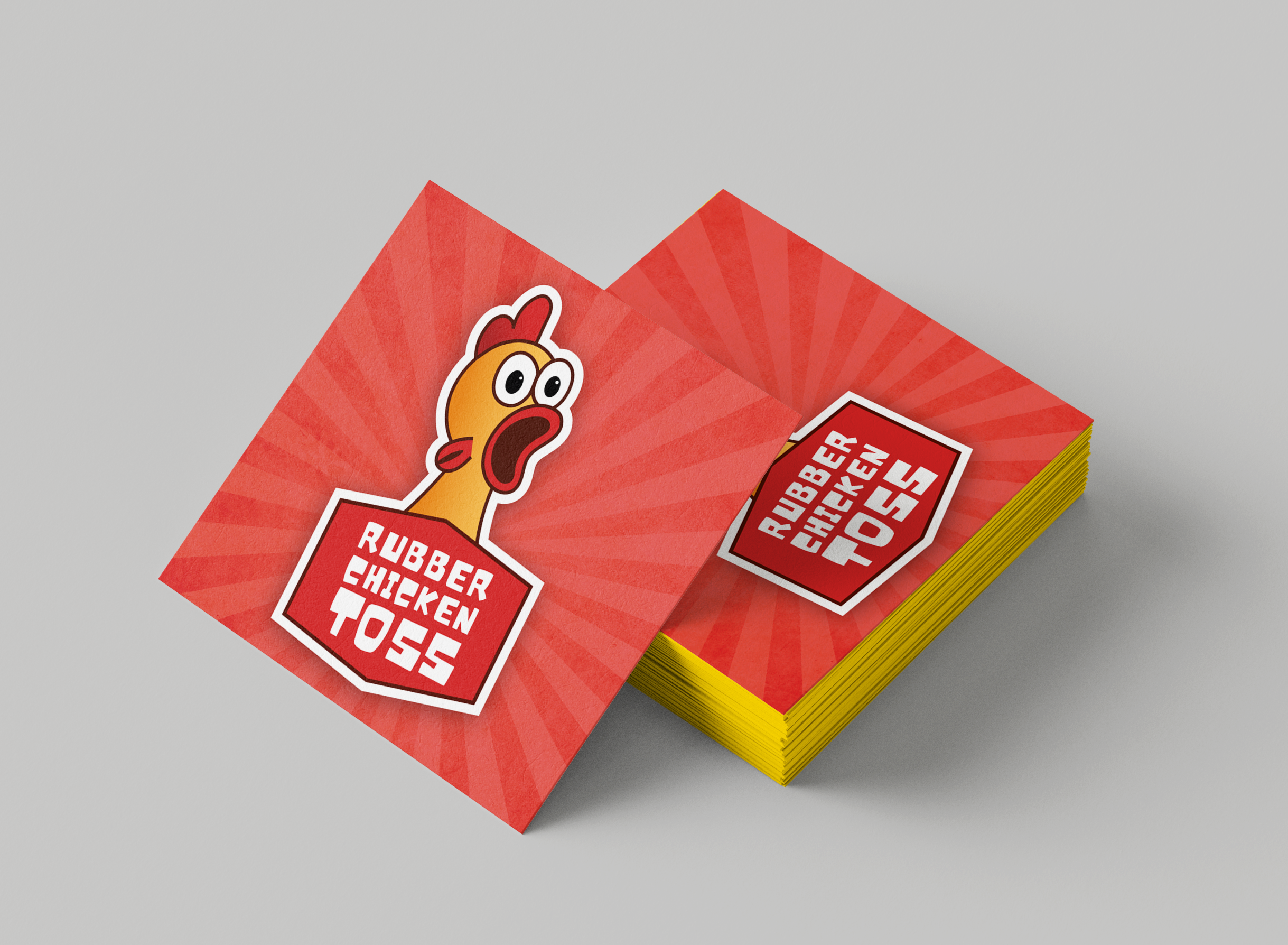
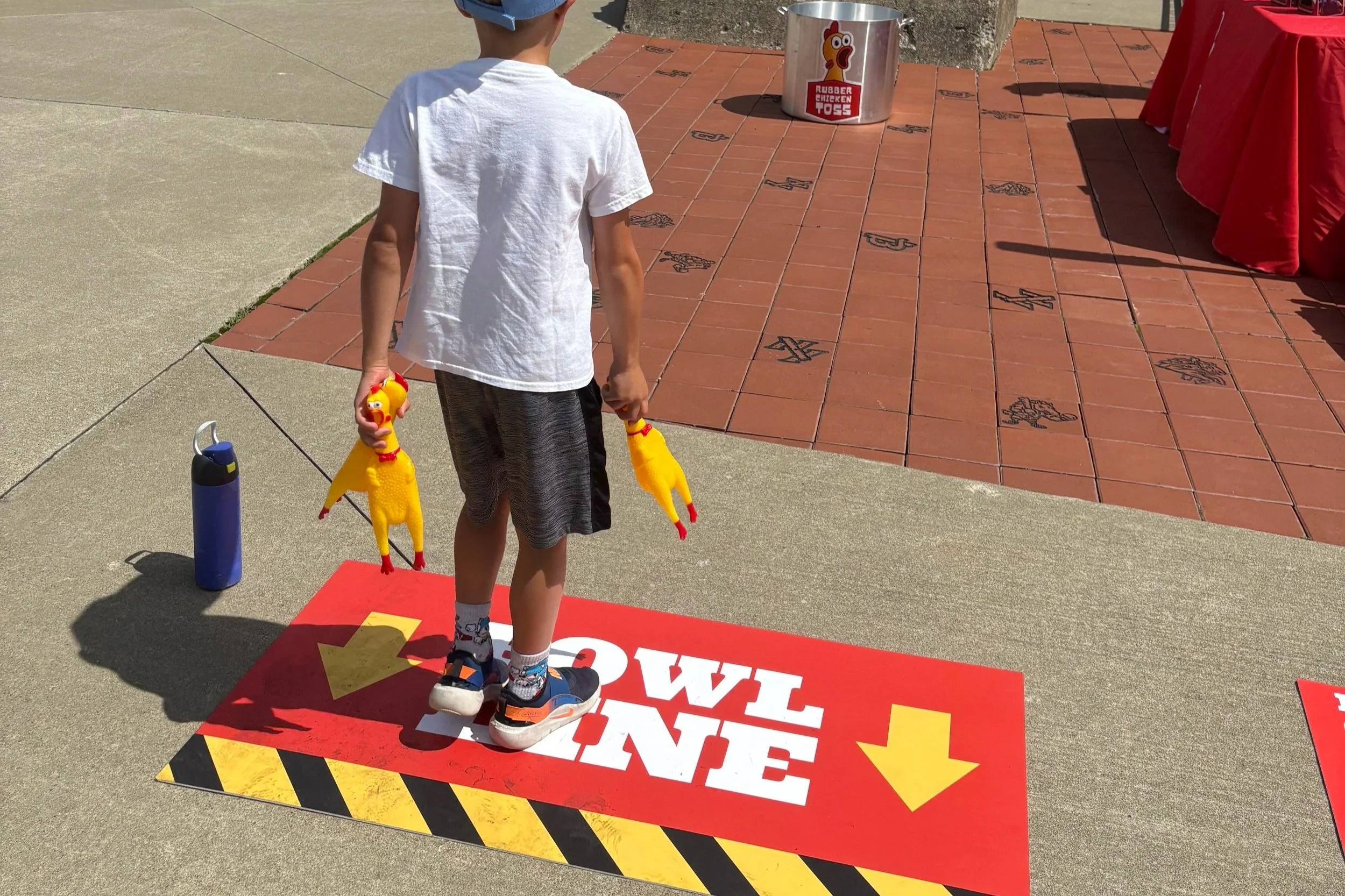
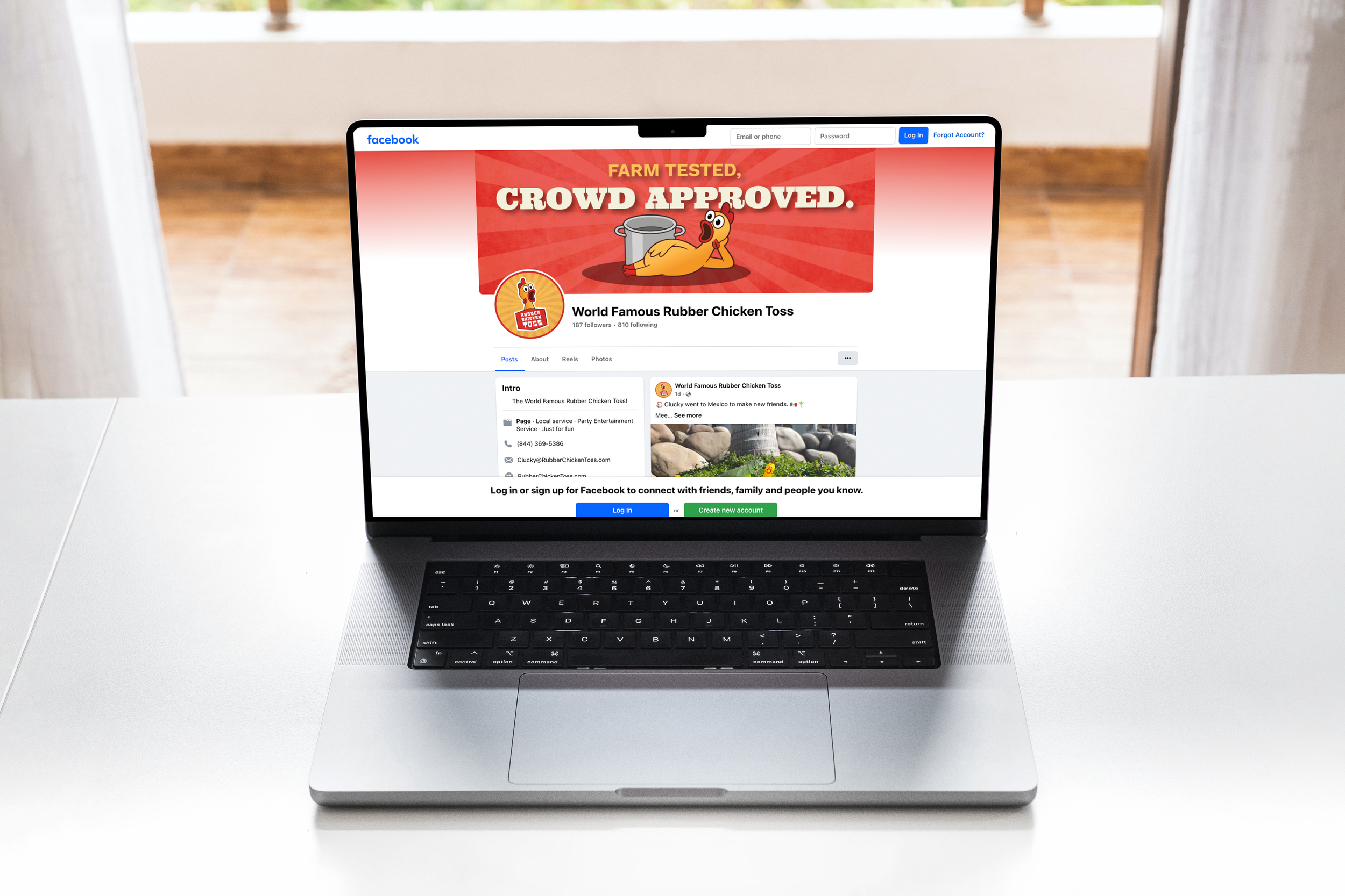
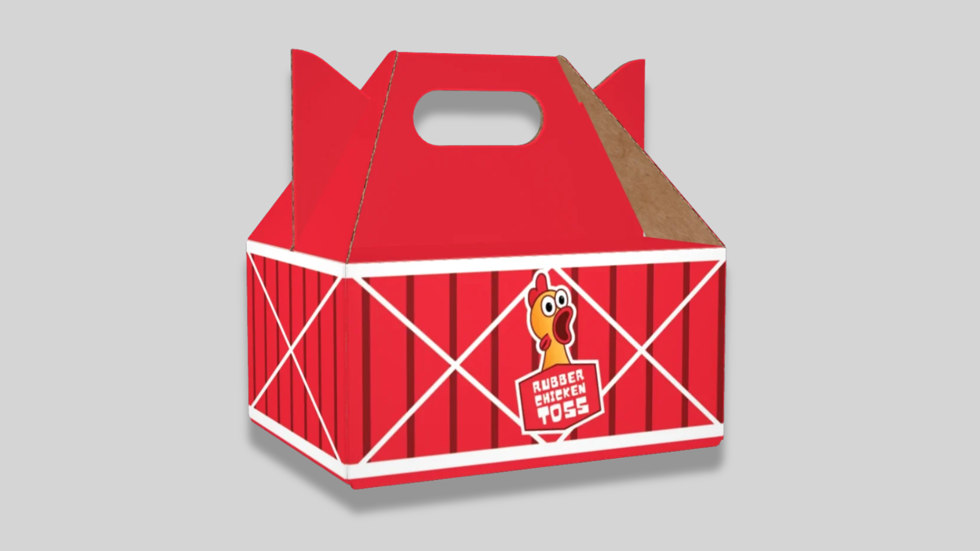
The Rubber Chicken Toss started as one person’s passion project and needed a brand worthy of the idea. We built it from the ground up: a name that sticks, a logo with a sense of humor, and a website that makes it easy to join in. We also created social assets to build buzz, event collateral to run the day, and swag people actually want to take home. The result is an activation that looks as fun as it is, whether you’re a first-time tosser or a returning champion.
how we did it
We started with the spirit of the thing: absurd, welcoming, and a little competitive. That became the brand’s voice and look, bold and playful without trying too hard. From the logo we built a flexible system of color, type, and illustration that works on a screen, a banner, or a T-shirt. We designed the website and social templates so the client could keep feeding the community without starting from scratch, and we developed the event collateral and swag as one cohesive set. Everything feels like part of the same game, from the first post to the last prize.
logo design
see the work

Ready to rock something with us?
Maybe you saw something you’re in need of. Or maybe you’ve been putting off that rebrand FOREVER. Either way, we got you.